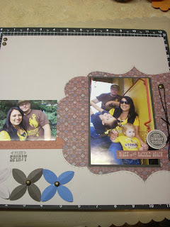
I try to include a page about each of the families that we are close to in my albums every year, and I think these portraits, taken by a friend of Chelsea's, are a great way to end the 2012 album. I will have a page for each of the other families too, when I can get my hands on some pictures! ;)
I love how the special cut oval accents the larger family picture here.
With the family picture in the middle, I wanted to keep the focus on the couple first, so I kept their picture on the left hand page. Going with how the eye is going to move across the page.
Then on the right page I could focus on the kids more. I did put special emphasis on our nephew and his daughter, they look so much alike.
The cards were fun! I picked a card from our idea book (page 107) and designed the 3 cards this month on that layout design.
I just moved things around, and added stamping until I was comfortable with the final card.
Each of the cards has a bit of a different feel, but they are all masculine and will make great birthday cards.
A little bit of that western flair makes this one my favorite.
See you next time, connie


No comments:
Post a Comment